Task
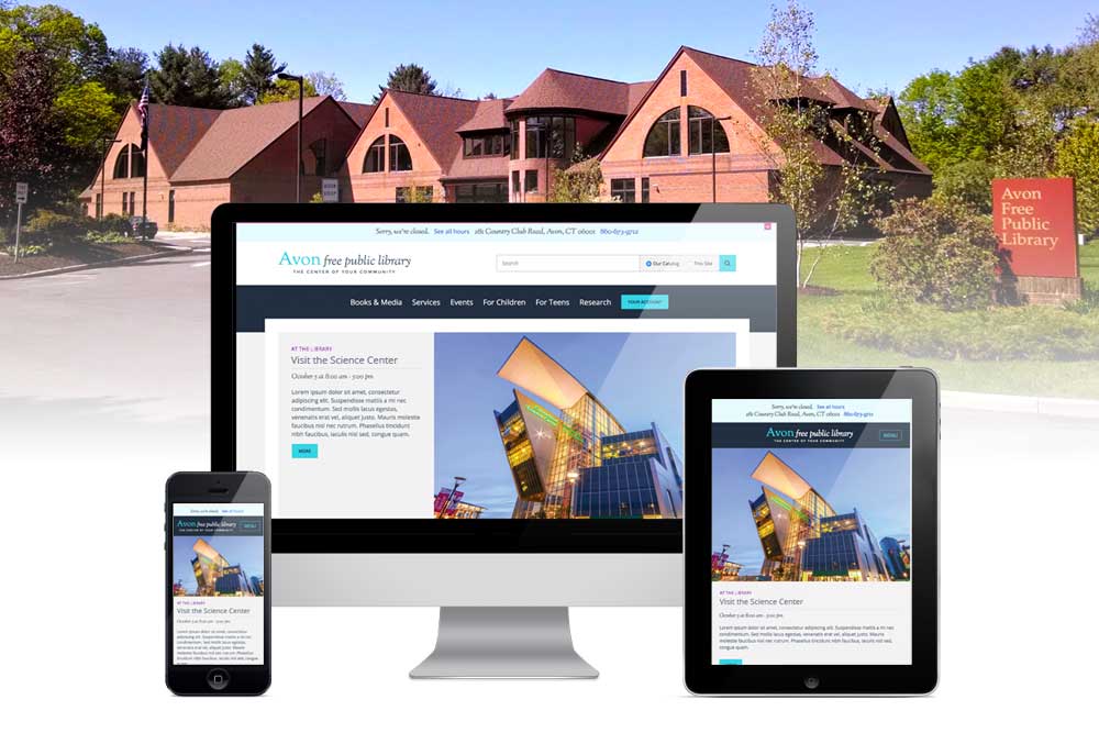
A responsive WordPress website for a small public library known for hosting innovative events and programs. The site needs to showcase both the library as a place to visit as well as its digital collections.
Timeline
- Nov 2016- Aug 2017: design and development
- late Aug 2017: user testing with staff and patrons
- Sep 2017: website launch
Team
3-Person team: As the library’s Technology & Technical Services Manager, I worked with web designer, Eric Gauvin and our Library Director on this project.
- The Library Director and I worked together to define requirements, get staff feedback, test components, and ensure interoperability with other online services like the library catalog.
- I designed the content and information architecture, including the site map and custom content types for reusing and displaying groups of library resources.
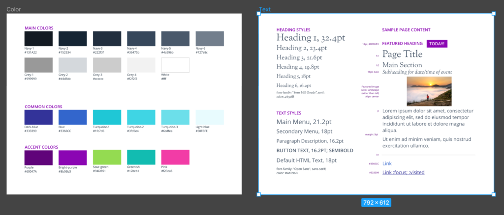
- The web designer created the visual style and theme, branding, and custom plugins.
- We collaborated on initial user testing, and I conducted ongoing site updates and additional user testing after launch.
Discovery
Evaluate existing content: I inventoried existing site content, including feedback gathered from staff and patrons of what was missing, confusing, or difficult to use.
Key takeaways were:
- Events were one of the main things people visited the website to find. They could find big event announcements on the homepage, but a separately-hosted events calendar meant that users couldn’t find events using the default site search, providing a disjointed experience. We needed a fully integrated events calendar that still allowed staff to manage room bookings and event registration in one place.
- Research databases and other content that appeared on multiple pages on the site got out of sync, because edits might only happen in one place. We needed a content strategy that allows staff to update content in one place and easily reuse it across multiple pages.
- Librarians use logos to distinguish between items in a list of resources, but few of those logos are meaningful to patrons and create visual noise. We needed a consistent format that helps users distinguish key features and choose between items.
- The old website used too much library jargon. We needed to create navigation and descriptive text in plain English.
We evaluated similar sites for layout and content organization, paying particular attention to the elements from our key takeaways.
We defined key user stories, which were then used to map navigation and page layout.
Process
Information architecture and navigation
I created a site map and coordinated with the web designer on navigation.
Problem: There were a few common user tasks, like “Reserve a Meeting Room”, that didn’t make sense to put in top-level navigation, but that could get lost buried on an internal page.
Solution: We created a “How Do I…?” section on the homepage to group these simple, common tasks up front.
Setting up an events calendar
Problem: On the old site, the events calendar was disconnected from website in a separate app. It had to be searched separately and provided limited options to display events on the main website. However, it worked well for staff, because it managed events, room reservations, and event registration in one place.
Solution: We used The Events Calendar by Modern Tribe to set up a fully integrated events calendar. We developed a custom plugin, Venue Check, to maintain room reservations as part of the calendar. Staff could manage events and room reservations in a single place as well as control how and where events would be featured on the homepage or Children’s and Teen pages.
It worked well, but for one thing: event registration seemed to work when we tested it with a few staff and users pre-launch, but the Children’s staff– a primary user group– were unavailable to test before we went live.
Well, it didn’t work for the Children’s staff. They needed to create custom registration forms that they could reuse easily for multiple events, which wasn’t possible. They needed to easily print attendee lists to check people into the Art Studio, but there was no option to print. In short, because I didn’t fully understand their needs, I had solved the wrong problem.
Once I was able to observe them, found a different registration plugin that resolved those issues.
Grouping information in a meaningful and scannable way
Problem: Online collections, museum passes, and local community resources all appeared in separate places. When content edits were not made to each location, inconsistencies built up over time. The formatting of each list varied, and logos associated with each resource created a cluttered, ad-like look to the page.
Solution: I created a custom Resource post type and taxonomies to group and reuse content. Each resource followed a consistent format to help users scan for what they needed. They could be updated or set to expire individually.
By creating different templates to customize views by audience or section, I could display the same resource in different locations. A resource on the Children’s Homework Help list appears in larger fonts with images, while the same resource appears in list form on the Research page.
Extending website branding for a more consistent user experience
Problem: Print materials and marketing lacks consistency.
Solution: I created a style guide based on the website redesign in Figma and Canva as well as logo templates for Microsoft Publisher to make it easier for staff to incorporate consistent styling and branding into library materials.

Outcome
We designed a fully responsive website with an integrated events calendar and clear access to online library resources. We received a lot of positive feedback from patrons and staff.
Lessons learned
Manage roadblocks on the timeline
Our timeline for this project stretched 3 months past our initial deadline as the project paused when we each had to work on other projects. The biggest challenge with pausing was trying to find where we left off when we resumed. A Kanban board would have been an easy, visual way to manage the task list and pick up where we left off.
User testing is not just for end users
We built opportunities for testing and feedback for wireframes, specific components, and prior to launch, but this project taught me to think more strategically about who, when, and how we involve people in testing. By not testing event registrations with Children’s staff, it created more work and frustration on all sides, because we had to fix it once the site was already live. By working with those staff later to understand their needs and fix the problem, we arrived at a better solution not just for them, but for other staff and the public as well.
